
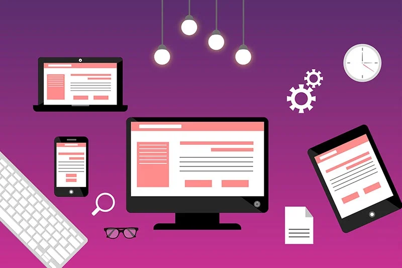
What is a visitor viewing on your website?
Do you know how your website looks on all devices? How your website looks on desktop, laptop, tablet, and mobile determines whether your visitor will have a meaningful and logical presentation of your content. Not having attractive, balanced content in the right order can significantly reduce the user's experience and interest in the website.
In this post, we will look at the three most important web design factors to achieve a good responsive website design that drives targeted traffic and converts visitors into leads.
Good web design appeals to your customer's subconscious
Websites get traffic from a link of interest to the user. The website is where most conversions happen. It can be making an appointment, buying a product, downloading an official document or registering for an event.
Good design is most important on a website where a single click of the mouse will make the user stay or leave the site, never to return. Attracting and keeping a visitor's attention is not an easy task, even when the user's subconscious gives the signal "okay" to continue. You only have a few seconds to attract a visitor or lose them forever. Engagement and interactivity require an optimal experience from whatever device the website is viewed on. In this day and age, the mobile experience is by far the most important to attract and retain the ideal customers in your market.
The three most important factors in good responsive web design are customization, organization, and quality
- CONFIGURATION: refers to the display of content on all devices, including mobile devices horizontally and vertically. How does the content adapt to the device? Are there appropriate font sizes, line heights for text wrapping, and spacing around content elements? Are there large spaces where the content is poorly balanced? Are some areas of content overlapping, or is some content only accessible by scrolling to the right?
- ORGANIZATION: viewing content arrangement on all devices. Is the content organized in the correct order that makes sense for user interaction on all devices? Is the most important content above the fold before scrolling? Does the content end with a call to action without delay?
- QUALITY: content quality review. Is it free of spelling and grammatical errors? Is it interesting and compelling? Is he talking to the ideal customer and tugging at their heartstrings with the feeling that you are offering the perfect solution to their problem? Even if it is, is the textual content broken up or formatted to keep the visitor's attention? This may be achieved through engaging images, videos, headers, sub-headers, icons, teaser content and collapsible elements. In addition, there is the importance of colors in design and logos. Colors can have a significant impact on the industry targeted. The colors should also go well with the logo. Finally, font sizes and styles should enhance the design and readability of textual content.
Factor 1: Customizing Responsive Web Design
Adjustment issues are common on mobile devices. Common alignment issues include layout of content in columns, font styles, and padding around content elements. It's always best to evaluate a design on a real mobile device, as the browser simulators that most web developers rely on can be inaccurate.
A four-column layout on a desktop or laptop may look great on a tablet, but again, it can compress content, distorting the appearance of rows where content should be smooth and balanced. In some cases, the content of the tablet can vary from four to two columns, leaving a small image or video on one side and a large amount of text on the other. Sometimes aligning a row in the middle can fix mobile adjustment problems.
Title cover, image and embedded video should be resized for mobile. The adjustment should never create unwanted spaces around the perimeter of the content. Left and right margins should be appropriate for the device to allow some padding, but not so much that it affects the design or detracts from the content.
Logos and fonts may also need adjustments. The logo should be the appropriate size with enough padding for a mobile device. Regarding fonts, font sizes and line heights should be adjusted for better display and readability. Some WordPress themes include customization of mobile logos and customization of font size and line height. But more often than not, these styles require custom CSS.
Factor 2: Content organization in your site design
Content organization is an important factor in user experience. This means that the content must be displayed in the correct order on all devices. This ensures that the sequence of the presentation will be meaningful and logical. A logical order of content might include a header image, followed by an opening headline, and descriptive text that defines the main problem for the specific market you're targeting.
The order and type of content should be based on the purpose of the page. It could be sales, marketing, new product launch, information, education or entertainment. A professional copywriter and digital content marketing specialist can help you create the type of compelling content and layout to engage your visitors and drive them to action.
When it comes to mobile devices, it's especially important to check for content order issues. On desktop, this might not be too much of a problem if the video is on the left and the teaser content is on the right. But on a tablet or phone, the video will be displayed on top of the teaser content - not very desirable if you want to motivate the user to watch the video. Regardless of the type of content, you'll want it to display logically and in a balanced way across all devices, especially tablets, where customization is common.
Factor 3: Quality of content in your site design
Quality refers to the consistent and aesthetically pleasing design and layout of pages, posts, footers, and content with optimal responsive display for mobile devices. The copy must be free of spelling and grammatical errors. Content should be interesting and compelling. It should speak to the ideal customer, letting them know that you understand their problem, have the perfect risk-free solution, and are a company they can trust. This may be achieved through engaging images, videos, headers, sub-headers, icons, teaser content and collapsible elements. A relevant call to action should always be included as the final content. This could be a button associated with an inquiry or feedback form, or a link to purchase a product or register for an event. Links to external content should always open in a new window to return the user to the website when they close the linked page.
Colors in design and logos can have a significant impact on the target industry. The colors of the design should go well with the logo. Finally, font sizes and styles should enhance the design and readability of textual content.
Choosing a web design and development company
A good responsive web design company will analyze the design on all types of devices. They will use CSS to adjust columns, padding, and font styles to optimally display content depending on the device. This can greatly enhance the user experience and interest in being on the website.
We invite you to order a free consultation from a digital agency iWeb with additional site analysis. This will be an informative, no-pressure session to analyze the quality of your website and provide suggestions for improvement. We can also reveal some strategies that will allow you to outperform the competition, regardless of industry.